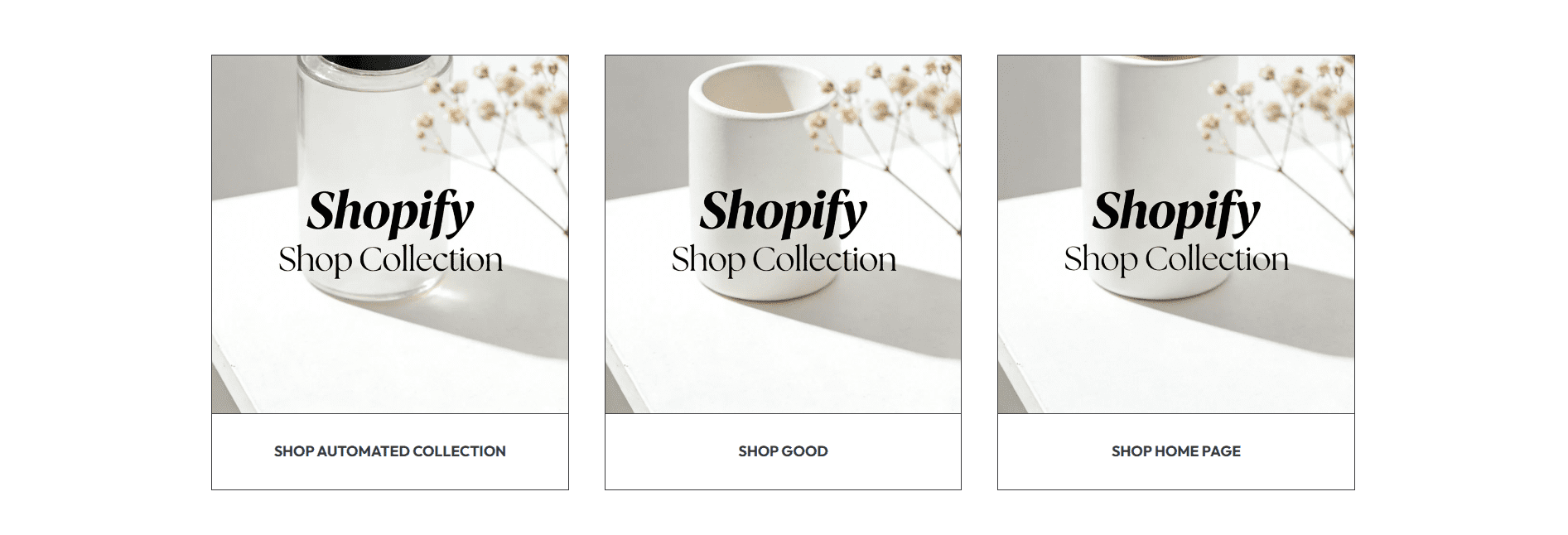
This guide explains how to configure the Collection List section of your Shopify store— a high-visibility navigational section that displays multiple product collections (e.g., categories, seasonal lines, or themed groups) in card format. It helps visitors quickly browse and access different product groups, driving discovery and sales.
The title for your Collection List section (sets context for the displayed collections).
Our Collections, Shop By Category, Featured Series, or Explore Our Range.Slider (default: 100%) that adjusts the size of the section heading.
80% (subtle, secondary heading) and 120% (prominent, primary heading) to match your store’s page hierarchy.120% — oversized headings can crowd collection cards, especially on mobile screens.Controls the number of collection cards displayed in a single row (desktop only — mobile auto-stacks to 1 column).
Sets the aspect ratio for all collection card images (ensures consistent sizing across the list).
1:1 (Square): Clean, uniform look (great for product category images).4:3: Slightly landscape format (ideal for lifestyle collection imagery).3:4: Vertical format (perfect for tall product shots, e.g., clothing or home decor).Slider (default: 300 px) that controls the fixed height of collection card images (width scales automatically per the image ratio).
200 px (compact) to 400 px (immersive).300 px as a baseline — increase for larger, more visual collections (e.g., home decor), decrease for small accessory categories.Slider (default: 100%) that adjusts the size of text (heading/description) on all collection cards.
90-110% — this section is meant to be scanned quickly, so text should be clear but not overwhelming.Controls padding above and below the Collection List to ensure it fits smoothly with adjacent content.
44 px): Increase to 60-80 px if the section feels cramped against the element above (e.g., a banner or rich text section).44 px): Match to top spacing for visual symmetry, or reduce to 20-30 px before a footer.Customize each collection card (add/edit via the "Add block" button in the customizer):
Select the Shopify collection to link to this card (the core functional setting).
The visual thumbnail for the collection card (replaces the collection’s default image if set).
PNG or JPG file.The title displayed on the collection card (overrides the collection’s default name if set).
Skincare, Accessories, or Sale.Home Decor instead of home decor) for a polished look.Optional short text below the heading (adds context to the collection).
3-6 collections (too many cards overwhelm visitors, too few look sparse).