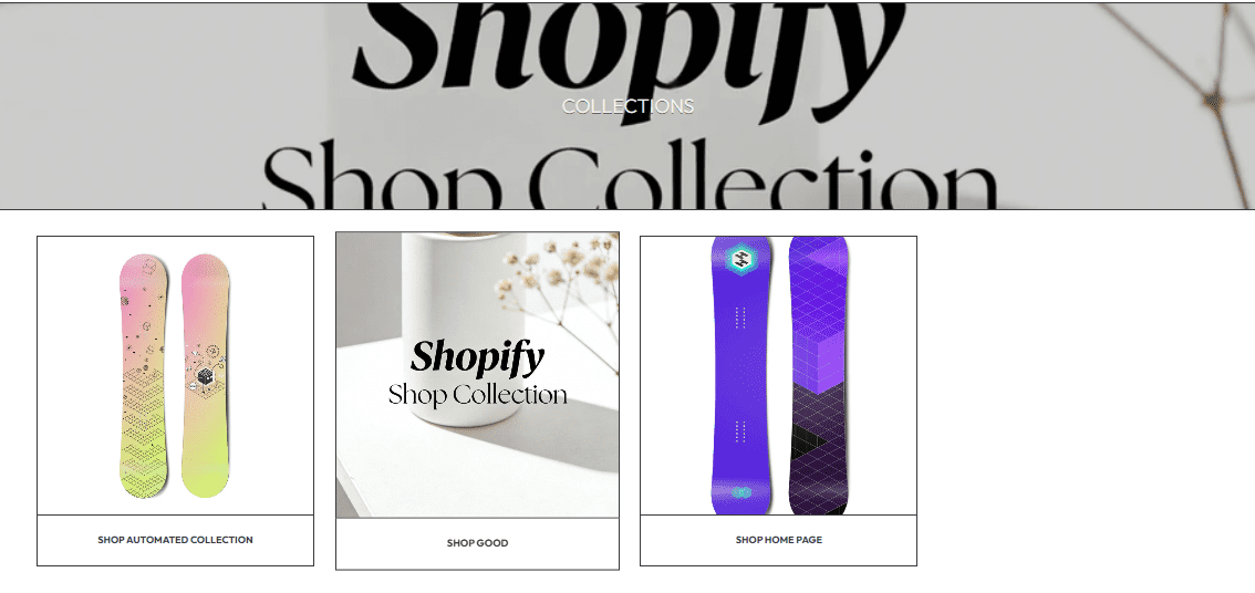
The Collection List Page is the page visitors see when they navigate to yourstore.com/collections — it displays all active collections in your store (e.g., product categories, seasonal lines) in a card-based list. It’s a key navigational page that helps users browse your store’s product groups quickly.
These settings control the page’s header, banner, and basic layout:
Sets the main title of the Collection List Page (displayed at the top of the page).
Collections (clear, direct label for the page’s purpose).Shop Our Categories or Product Lines).Slider (default: 100%) that adjusts the size of the page’s Heading text.
80% (subtle) and 120% (prominent) to match your store’s page hierarchy.120% — oversized headings can crowd the top banner.Uploads a background image for the page’s top banner (displays behind the Heading).
PNG/JPG (recommended ratio: 16:9 for wide, responsive banners).Adjusts the internal spacing (in rem) above and below the banner’s Heading text.
1 rem (balanced spacing for most banner designs).1.5-2 rem for larger banners; decrease to 0.5 rem for compact layouts.Adds a semi-transparent overlay to the banner image to ensure the Heading text is readable (critical if your banner image has busy visuals).
Text protection layer slider (below) to adjust brightness.Adjusts the banner overlay’s brightness (only active if Use text protection layer is enabled):
0 (default): Darkens the image (best for light-colored text on bright backgrounds).Controls the order in which your store’s collections are displayed on the page.
Alphabetically, A-Z (simple, consistent sorting).Date created (newest first), Best selling, or Manual (drag-and-drop to reorder).Manual sorting to prioritize high-conversion collections (e.g., New Arrivals, Sale) at the top.These settings control the styling of the collection cards and banner:
Adds a border to all media elements (banner, collection cards) on the page.
Sets the fixed height (in pixels) of the page’s top banner.
300 px (balanced height for most desktop/mobile screens).400 px for more prominent banners; decrease to 200 px for compact layouts.Controls how many collection cards are displayed in a single row (desktop only — mobile auto-stacks to 1 card per row).
4 (compact, fits more collections per view).2-3 for larger collection cards (ideal if your collection images have detailed visuals).Sets the aspect ratio for all collection cards’ images (ensures consistent sizing across the list).
Square (uniform, clean look for most collection images).16:9 (landscape) for lifestyle shots, 3:4 (vertical) for product-focused images.Changes the corner shape of collection cards, buttons, and images on the page.
Square (sharp corners).Rounded (soft corners) or Pill (rounded edges) — align with your brand’s visual style.Products → Collections) — empty cards confuse visitors.Manual sorting to put high-traffic collections (e.g., Sale, New Arrivals) at the top of the list.