Product Content Setup Guide
The Product Content section of your Shopify store displays detailed product information (e.g., features, material, care instructions) on the Product Page. Its content is automatically synced from the "Description" field in your product’s backend edit page — any edits to the product description (lists, headings, text) will update this section in real time.
Access Product Content settings in:
Online Store → Themes → Customize → Products → Product content
Edit the content displayed here in:
Products → [Your Product] → Description (backend edit page)
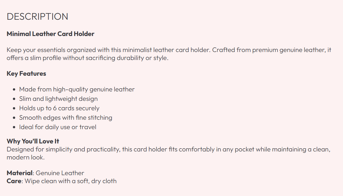
Edit Product Content (Backend Description Field)
The content in the Product Content section is controlled by the Description field in your product’s backend edit page (shown in the first image). Format this field to organize info — the styling (headings, lists, paragraphs) will carry over to the front-end Product Content section.
- Headings: Use headings (e.g., "Key Features", "Why You’ll Love It") to split content into scannable sections (helps visitors find details quickly).
- Bullet lists: Highlight core features (e.g., "Slim and lightweight design") — lists are easier to scan than long paragraphs.
- Paragraphs: Add benefit-focused context (e.g., "Fits comfortably in any pocket while maintaining a clean, modern look") instead of just listing features.
- Critical details: Include material ("Genuine Leather") and care instructions ("Wipe clean with a soft, dry cloth") — this reduces post-purchase support questions.
Organize your description into 3-4 clear sections (Features → Benefits → Material → Care) — this makes content easy to digest, even for busy visitors!
Product Content Section Settings
These settings control the layout and styling of the section (content edits happen in the backend product page).
Section Spacing
Adjusts padding above/below the section to fit your Product Page’s flow.
- Top spacing (default:
0 px): Keep at 0 px to align with content above (e.g., Buy Buttons). Increase to 10-20 px if the section feels cramped. - Bottom spacing (default:
32 px): Controls the gap to the section below (e.g., Related Products). Adjust between 20-40 px for visual balance.
Theme Settings
Inherits global theme styles to shape the section’s appearance:
- Image ratio: Affects inline images added to the product description (e.g., material close-ups). Use
Square (default) or match your product imagery’s ratio. - Border Style: Adds a border around the section.
No border (default) = clean look; Border = visual separation from other content. - Global border radius: Sets corner shape for elements (e.g., inline images). Choose
Square, Rounded, or Pill to match your brand. - Show vendor: Toggle to display the product’s brand name at the top of the section. Enable for multi-brand stores to highlight recognizable vendors.
Custom CSS
Advanced: Add custom CSS to modify styling (e.g., text color, heading sizes, list spacing).
Only use Custom CSS if you know CSS — incorrect code can break formatting (e.g., make text unreadable on mobile).
Best Practices for Product Content
- Focus on user benefits: Write "Slim design fits comfortably in any pocket" (not just "Slim design") — explain how features help the user.
- Keep it scannable: Use short paragraphs (2-3 sentences max) and bullet lists — most visitors won’t read long blocks of text.
- Add inline images: Insert small visuals (e.g., fabric texture) into the description to reinforce details (use the backend Description field’s image button).
- Update regularly: Edit the backend Description field if material/care info changes — the Product Content section updates automatically.
- Mobile-test formatting: Ensure headings/lists display clearly on mobile (avoid tiny text or overlapping elements).
The Product Content section answers visitor questions before they ask — use clear, organized, benefit-focused content to build trust! Remember: all content edits happen in the backend product Description field (not the theme customizer).