Media with Text Setup Guide
This guide explains how to configure the Media with Text section of your Shopify store— a versatile, high-converting section that pairs visual media (images or videos) with descriptive text (headlines, product details) to showcase products, tell brand stories, or highlight value propositions.
All settings mentioned below can be found in:
Online Store → Themes → Customize → Media with text
Media (Image/Video) Settings
Image
The primary visual asset (e.g., product shot, lifestyle image) displayed in the section.
- Upload high-quality
PNG (transparent background) or JPG files. - Recommended resolution: 2× the intended display size (for sharpness on retina screens).
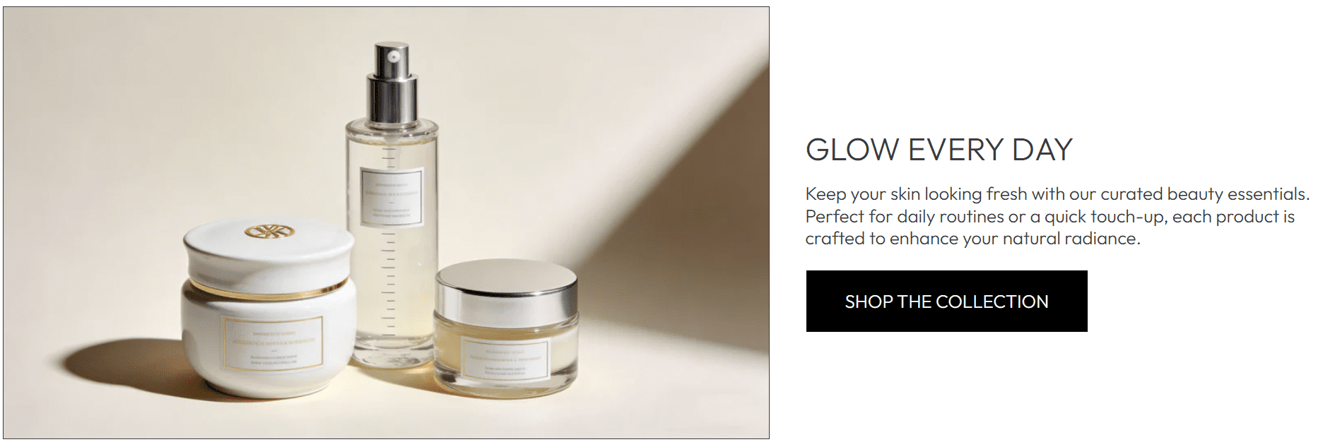
- For product-focused sections (like the beauty essentials example), use clean, well-lit product imagery to highlight details.
Shopify-hosted video
Optional: Replace the image with a short video (e.g., product demo, lifestyle clip) for more engaging content.
- Click Select to upload a
.mp4 file (only supported format). - Keep file size under 50MB (use tools like HandBrake to compress) to avoid slow page loads.
- Use short clips (15-30 seconds) to showcase product use cases (e.g., a skincare routine demo).
Large video files (over 50MB) will increase page load time—this harms user experience and may reduce conversions.
Media ratio
The aspect ratio of your media (image/video), ensuring it displays correctly without distortion.
16:9 (default): Widescreen format, ideal for landscape images/videos (like the beauty product example).- Other common options (if available):
4:3 (square-ish) for close-up product shots, 2:3 for vertical lifestyle imagery. - Match the ratio to your media’s native dimensions to avoid black bars or cropping.
Media width
Slider (default: 1100 px) that controls the maximum width of the media (image/video) in pixels.
- Adjust between
800 px (compact layout) and 1200 px (wide, immersive layout). - For the beauty essentials example,
1100 px balances media visibility and text space (avoids crowding the right-side copy).
Text & Layout Positioning
Text layout
Controls which side of the media the text content appears on.
- Right (default, as in the example): Text sits to the right of the media—works for landscape images where the visual focus is on the left.
- Left: Text sits to the left of the media—use if your media’s key visual element is on the right.
Test both Left and Right layouts to ensure text doesn’t overlap with critical media details (e.g., avoid placing text over a product’s logo).
Content alignment
Horizontal alignment of the text content (heading, body copy, button).
- Center (default, example): Balanced, polished look—ideal for short, focused copy (like the "GLOW EVERY DAY" headline).
- Left: Traditional readability-focused layout (better for longer body text).
- Right: Stylized alignment (use sparingly for design contrast).
Content vertical alignment
Vertical position of the text content relative to the media.
- Center (default, example): Text aligns with the middle of the media—creates visual balance.
- Top: Text sits at the top of the media (use if the media’s top section has empty space).
- Bottom: Text sits at the bottom of the media (use if the media’s bottom section is uncluttered).
Visual & Typography Settings
Media animation
Optional animation effect for the media (image/video) when the section comes into view.
None (default): No animation (clean, minimal look).- Common options (if available):
Fade in (subtle opacity transition), Slide in (side-to-side movement). - Use subtle animations only—over-the-top effects can distract from your content.
Font size
Slider (default: 100%) that adjusts the size of all text in the section (heading, body copy, button).
- Adjust between
80% (subtle) and 120% (prominent) based on your page hierarchy. - For the "GLOW EVERY DAY" headline,
100% ensures readability without overpowering the media.
Section Spacing
Top spacing
Slider (default: 44 px) that sets the gap between the Media with text section and the content above it.
- Increase to
60-80 px if the section feels cramped against the element above (e.g., a header or banner).
Bottom spacing
Slider (default: 44 px) that sets the gap between the Media with text section and the content below it.
- Match the value to Top Spacing for visual symmetry, or adjust to fit your page flow (e.g., more spacing before a product grid).
Advanced Settings
Theme Settings
Dropdown to access theme-wide styles (e.g., text colors, button designs) that apply to the Media with text section.
- Use this to align the section’s button color, text font, and spacing with your brand’s global style.
Best Practices
- Pair media with concise text: Focus on 1 key headline + 2-3 short paragraphs (avoid long blocks of copy).
- Use the button (e.g., "SHOP THE COLLECTION") to link to a relevant collection/product page—drive action immediately.
- Test on mobile: Ensure media and text don’t overlap, and the button remains easy to tap.
- For product-focused sections: Use media that highlights the product’s key benefit (e.g., the glow of skincare products).
The Media with text section is one of the most versatile tools in your theme—use it to showcase products, share brand stories, or highlight promotions with a balanced mix of visuals and copy!