Header Setup Guide
This guide explains how to configure the Header section of your Shopify store — the top navigation bar that appears on every page of your site. A well-optimized header is critical for brand recognition, intuitive navigation, and mobile usability, directly impacting customer retention and conversion rates.
All settings mentioned below can be found in:
Online Store → Themes → Customize → Header → header
Logo Settings
Logo
This is your primary brand logo, displayed prominently in the header across all pages of your store (the most visible brand asset on your site).
- Upload high-quality
PNG (transparent background) or SVG (scalable vector) files — avoid JPG for logos. - Upload at 2× the intended display size (e.g., 140px width for a 70px display) for sharpness on retina/mobile screens.
- Transparent backgrounds are required for logos to work with both light/dark header styles.
Never use low-resolution logo files! Blurry logos damage brand credibility — ensure your logo file is at least 300 DPI before uploading.
Logo Inverse
The inverse logo is a secondary version of your logo used when the header is displayed on dark backgrounds (e.g., sticky headers on image banners, dark-themed templates).
- Use a light-colored (preferably white) version of your logo for maximum contrast.
- Match the dimensions/aspect ratio of your primary logo for consistency.
- If not set, the theme will fallback to your primary logo (may cause readability issues on dark backgrounds).
Create a dedicated inverse logo in your brand’s color palette (e.g., white logo with no background) — free tools like Canva or Figma make this quick and easy.
Logo Size & Position
Custom Logo Width
Controls the fixed width of your logo (in pixels) — height scales automatically to preserve the logo’s aspect ratio.
- Optimal range:
40px (compact) to 120px (prominent) — adjust based on your header layout. - Recommended starting point: 50–70px (balances visibility and navigation space).
- Test on mobile after adjustment — ensure the logo doesn’t overlap with menu icons.
Avoid logo widths over 120px! Oversized logos crowd the header, reduce space for navigation items, and cause layout breaks on mobile devices (critical for mobile-first Shopify stores).
Desktop Logo Position
Determines the horizontal alignment of the logo on desktop screens (mobile logo position is auto-optimized for small screens).
- Left – Traditional ecommerce layout (most common, aligns with user habits for navigation).
- Center – Modern, minimalist look (ideal for brands prioritizing visual branding over navigation density).
Mobile logo positioning is fixed to left/center (theme-controlled) to maximize screen space — no manual adjustment needed.
Navigation Menus
Menus are created and managed in Shopify Admin (not the theme customizer). All menus support 1-level items only (no nested/dropdown options).
To create/edit menus:
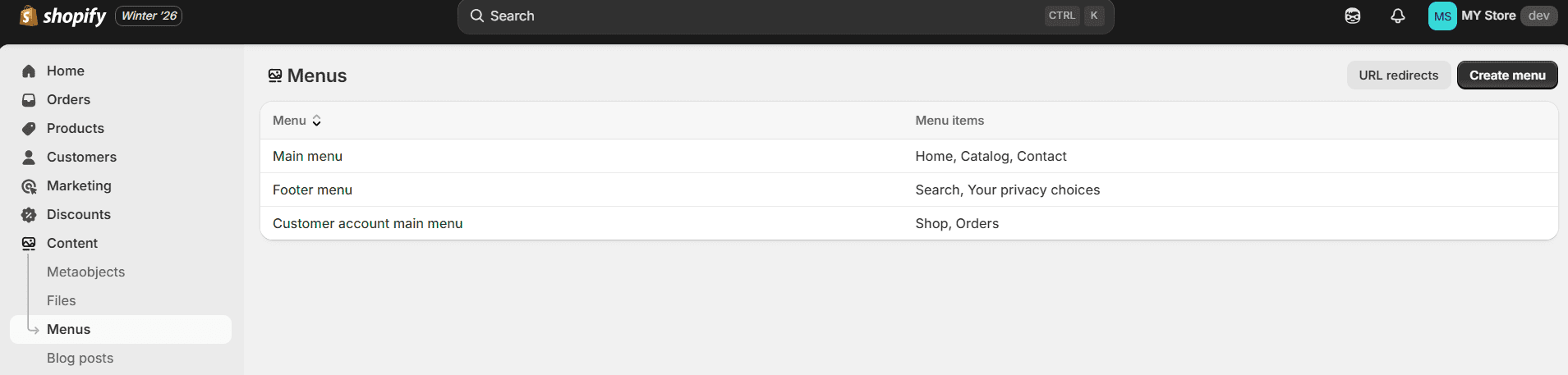
Shopify Admin → Content → Menus
Main menu
Your primary site navigation — assigned to the header to help customers access core pages (displayed prominently on desktop/mobile).
- Example items (from your Admin):
Home, Catalog, Contact - Curate to 3–5 items (keep it concise — too many links overwhelm mobile users).
- Include high-priority pages: Home, product catalogs, or key collection pages.
Footer menu
A utility menu (typically displayed in the footer, but may link to header elements on mobile).
- Example items (from your Admin):
Search, Your privacy choices - Use for secondary links: policy pages, search, or privacy settings.
Customer account main menu
A menu for logged-in customers (linked to the account icon in the header).
- Example items (from your Admin):
Shop, Orders - Include customer-specific links: Order history, saved items, or account settings.
Menu Highlighting
Highlight Menu Titles
Visually emphasize specific menu items (e.g., sale/promotion links) to drive clicks and conversions.
- Enter exact menu item titles separated by commas (case-insensitive):
Sale, New Arrivals. - Text must match menu titles exactly (e.g., "Sale" won’t highlight "Clearance Sale").
- Use for time-sensitive promotions only (overuse reduces impact).
Highlight Color
Sets the color for highlighted menu labels (text or background, theme-dependent).
- Choose a high-contrast color from your brand palette (e.g., red for sales, brand accent color for new arrivals).
- Test contrast against header background — ensure highlighted items stand out but don’t clash with brand styling.
Best Practices for Optimal Header Performance
- Keep menus concise: Limit
Main menu to 3–5 items (mobile users won’t scroll through long lists). - Test across devices: Verify header layout on desktop, tablet, and mobile (iOS/Android) — fix overlapping elements immediately.
- Logo visibility: Ensure both primary/inverse logos are readable on all header backgrounds (test sticky header on image banners).
- Highlight sparingly: Use menu highlighting only for high-priority promotions (1–2 items max) — too many highlighted items look spammy.
- Speed optimization: Compress logo files (use TinyPNG) to avoid slow header loading (critical for mobile page speed scores).
A well-configured header is the foundation of a user-friendly Shopify store. It reduces bounce rates, improves navigation efficiency, and strengthens brand recognition — invest time in testing and optimizing these settings for maximum impact!