Cart Drawer Setup Guide
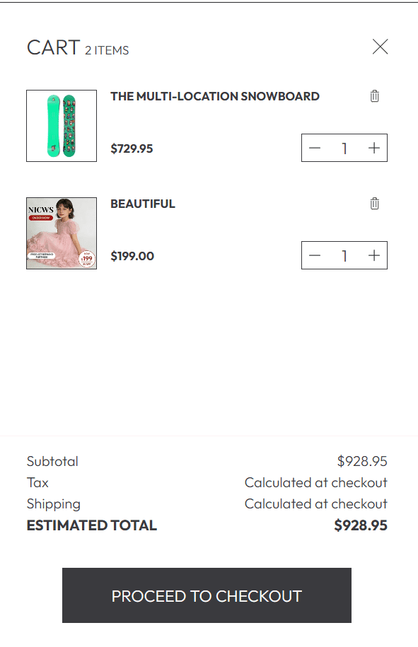
This guide explains how to configure the Cart Drawer section of your Shopify store — a slide-in cart interface that appears when customers add products to their cart. It provides a seamless, non-intrusive shopping experience, allowing customers to review their cart items, adjust quantities, and proceed to checkout without leaving the current page (critical for reducing cart abandonment and boosting conversions).
All settings mentioned below can be found in:
Online Store → Themes → Customize → Home page → Overlay Group → Cart drawer
Overall Cart Drawer Settings
Image Ratio
Controls the aspect ratio of product images displayed in the Cart Drawer (ensures consistent sizing across all cart items).
- Adapt to image – Uses the original aspect ratio of your product images (best for mixed image styles).
- Portrait – Forces a vertical (3:4) aspect ratio (ideal for clothing, furniture, or tall product shots).
- Square (1:1) – Default option; creates a clean, uniform look for all cart item images (recommended for most stores).
Stick to Square ratio for consistency! Mixed aspect ratios can make the cart look cluttered — uniform images improve scannability for customers.
Variant Option for Swatches
Defines which product variant names display as visual swatches (instead of text dropdowns) in the Cart Drawer (e.g., color options).
- Enter variant names separated by commas:
Color, Colour (matches common color variant labels). - Variant names must exactly match your product variant options (case-insensitive, e.g., "color" works for "Color").
- Limit to 1-2 variant types (e.g., only Color) — too many swatches crowd the cart item layout.
Global Border Radius
Controls the corner shape of all elements in the Cart Drawer (buttons, product cards, input fields).
- Square – Sharp corners (minimalist, modern look).
- Rounded – Soft, rounded corners (default; approachable, friendly aesthetic).
- Mixed – Combination of square/rounded corners (use only for custom brand styling).
Upsell Product Source
Determines where the Cart Drawer pulls upsell products from (displayed at the bottom of the cart to encourage additional purchases).
- Related products – Auto-generates upsells based on the products in the cart (algorithmic, low-effort).
- Product list – Lets you manually select a curated list of upsell products (better for promoting specific items like accessories or complements).
Product List
Used exclusively when Upsell Product Source is set to Product list — select your pre-created Shopify product list for upsells.
- Click the dropdown to choose an existing product list (create lists in Shopify Admin → Products → Lists).
- Curate small lists (2-4 products) — too many upsells distract from checkout.
Border Style
Controls whether borders are displayed around cart items, upsell cards, and input fields.
- No border – Clean, borderless design (ideal for minimalist store themes).
- Border – Subtle gray borders (default; adds structure without visual clutter).
Show Product Upsells
Toggles the display of upsell products at the bottom of the Cart Drawer (a key feature for increasing average order value).
- Enabled – Shows upsells (recommended for all stores to drive additional sales).
- Disabled – Hides upsells (use only if your cart feels too cluttered).
Enable Cart Notes
Adds a text input field for customers to include custom notes (e.g., gift messages, delivery instructions) with their order.
- Enabled – Displays the notes field (critical for gift shops, personalized orders, or B2B sales).
- Disabled – Hides the notes field (use for simple, fast-checkout stores).
If enabling Cart Notes: Keep the input field short (1-2 lines max)! Long text boxes take up too much cart space and slow down checkout.
Custom CSS (Advanced)
Add custom CSS to the theme’s "Custom CSS" section (in Theme Settings) to modify the Cart Drawer’s appearance beyond built-in options.
- Adjust heading size for cart items:
.cart-drawer h2 { font-size: 32px; }- Modify cart drawer padding and border radius:
.cart-drawer { border-radius: 8px; padding: 24px; }- Style cart item separators:
.cart-item { margin-bottom: 16px; padding-bottom: 16px; border-bottom: 1px solid #e5e7eb; }
Best Practices
- Keep it minimal: Avoid overcrowding the cart with too many options — prioritize core features (quantity adjustment, checkout button, upsells).
- Test mobile experience: Ensure the Cart Drawer is fully functional on mobile (swatches, quantity buttons, and checkout should be easy to tap).
- Optimize upsells: Promote low-cost, high-margin complements (e.g., socks with shoes, jewelry with dresses) — avoid unrelated products.
- Highlight checkout: Make the "Checkout" button high-contrast (match your brand’s primary color) to guide customers to conversion.
- Test loading speed: Ensure product images in the cart load quickly — compress images to avoid slow load times (critical for mobile users).
The Cart Drawer is a make-or-break element for user experience — focus on speed, simplicity, and clear calls-to-action to reduce cart abandonment and maximize sales!