Featured Collection Setup Guide
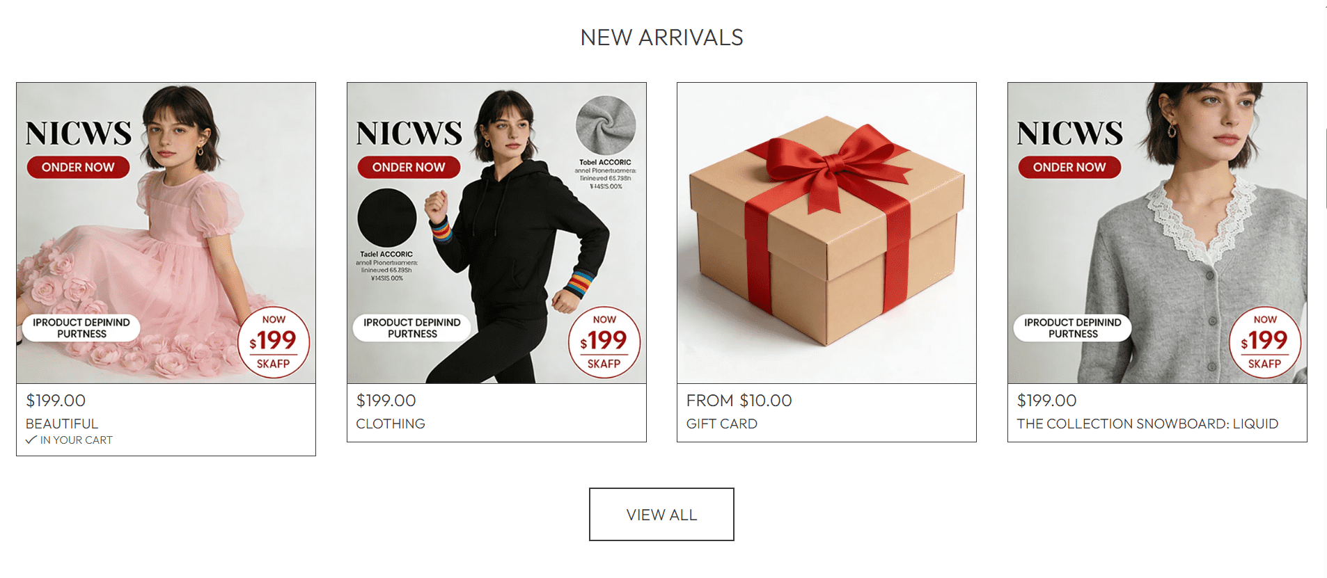
This guide explains how to configure the Featured Collection section of your Shopify store— a high-impact area for showcasing key product groups (like new arrivals, bestsellers, or seasonal items) to drive product discovery and sales.
All settings mentioned below can be found in:
Online Store → Themes → Customize → Featured Collection
Section Heading
Heading
Sets the title for your Featured Collection section (communicates the purpose of the product group to visitors).
- Default text:
New Arrivals (ideal for showcasing recent inventory). - Customize to match your product group:
Best Sellers (for top-performing items)Seasonal Picks (for holiday/weather-specific goods)Editor’s Choice (for curated recommendations)
- Keep text short (2-3 words) for clear, scannable communication.
Font Size (Heading)
Slider (default: 100%) that adjusts the size of the section heading.
- Adjust between
80% (subtle) and 120% (prominent) based on your page hierarchy. - Avoid sizes over
120%—oversized headings can crowd product cards, especially on mobile.
Product Card Settings
Collection
Selects which product collection to display in this section. A critical setting for targeting specific product groups.
- Click the dropdown to choose an existing collection (e.g., "New Arrivals" or "Summer Collection").
- Key Rule: If you do NOT select a collection (leave this field unset), the section will automatically load your store’s New Arrivals (no manual updates needed for new inventory).
Use the "auto New Arrivals" feature for your "New Arrivals" section—you won’t have to reselect the collection every time you add new inventory!
Font Size (Product Cards)
Slider (default: 100%) that adjusts the size of text on product cards (including product names, prices, and labels).
- Stick to
80-110% to ensure text (like prices) remains readable on small screens. - Match this size to your store’s overall product card typography for consistency.
Enable "View all" button if collection has more products than shown
Toggle switch that displays a "View all" button (linking to the full collection page) when the selected collection has more items than fit in the Featured Collection section.
- Recommended: Enable this switch—it lets visitors browse all items in the collection, increasing the chance of a purchase.
- The button will only appear if there are additional products (it won’t show if the collection fits entirely in the section).
Section Spacing
Top Spacing
Slider (default: 20 px) that sets the gap between the Featured Collection section and the content above it.
- Increase to
30-40 px if the section feels cramped against the element above (e.g., a Rich Text or Logo Banner section).
Bottom Spacing
Slider (default: 20 px) that sets the gap between the Featured Collection section and the content below it.
- Match the value to Top Spacing for visual symmetry, or adjust to fit your page flow (e.g., more spacing before a footer).
Advanced Settings
Theme Settings
Dropdown to access theme-wide styles (e.g., product card colors, button designs) that apply to the Featured Collection section.
- Use this to align product cards with your brand’s visual style (e.g., adjust button colors to match your logo).
Custom CSS
Dropdown for advanced users to add custom CSS (e.g., modify product card borders, adjust image padding).
- Only use if you have CSS knowledge—incorrect code can break product card layout on mobile.
Best Practices
- Showcase high-conversion collections (new arrivals, bestsellers) here—this section is one of the most visible on your store.
- Leverage the "auto New Arrivals" feature for new inventory (saves manual updates).
- Always enable the "View all" button to drive traffic to full collection pages.
- Test on mobile: Ensure product cards don’t overlap and text remains readable on small screens.
The Featured Collection section is a key driver of product sales—focus on showcasing your most compelling items (or auto-updating New Arrivals) to capture visitor attention quickly!