Product Page Setup Guide
This guide explains how to configure the Product Page of your Shopify store — the core page where visitors view product details, select variants, and complete purchases. A well-optimized Product Page directly impacts conversion rates, so it’s critical to fine-tune its content and functionality.
All settings mentioned below can be found in:
Online Store → Themes → Customize → Product page
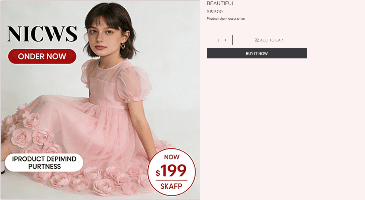
Product Header Block
Displays key product identification (name, vendor, short description) at the top of the page.
Show vendor
Toggle to display the product’s vendor/brand name (e.g., "Nike" for a sneaker product).
- Disabled (default): Hides the vendor name (use if your store sells only your own brand).
- Enabled: Shows the vendor (ideal for multi-brand stores to build trust with recognizable brands).
Short description
Customize the brief product summary displayed below the title (default: Product short description).
- Use 1-2 concise sentences to highlight core benefits (e.g., "Lightweight tulle dress with puff sleeves — perfect for special occasions.").
- Avoid generic text — focus on what makes the product unique (material, fit, use case).
Pull key details from your product’s full description (e.g., material, size range) to make the short description actionable!
Variant Picker Block
Allows visitors to select product variants (e.g., size, color) before adding to cart.
Type
Controls the visual style of the variant selector.
- Dropdown (default): Compact, menu-style selector (ideal for products with many variants, e.g., 5+ sizes).
- Button: Visual, clickable buttons (better for few variants, e.g., 2-3 colors — improves scannability).
Show color swatches
Toggle to replace color variant labels (e.g., "Pink") with visual color squares (more intuitive for visitors).
- Requirement: This theme supports custom images for color swatches (upload swatch images in your product variant settings).
- Use this for color-focused products (clothing, cosmetics) — visuals reduce confusion about "what the color looks like."
Buy Buttons Block
Controls purchase-related elements (add to cart, quantity, stock notifications) — the "conversion zone" of the Product Page.
Show low stock notification
Displays a "Low stock" message when inventory for the selected variant is running low (creates urgency).
- Requirement:
Inventory tracking must be enabled for the product (set in Products → [Your Product] → Inventory). - Toggle to Enabled for high-demand products — urgency can boost conversions.
Align low stock notification
Sets the horizontal alignment of the low stock message.
- Center (default): Balanced look (matches most Product Page layouts).
- Left: Aligns with the variant picker/button (use for left-aligned page designs).
Show recipient information form for gift card products
Displays a form to enter a recipient’s email/message (only applies to gift card products).
- Toggle to Enabled if you sell gift cards — lets customers send cards directly to recipients.
- Click Learn more for setup details (gift card-specific functionality).
Show dynamic checkout buttons
Displays one-click checkout options (e.g., PayPal, Apple Pay) alongside the "Add to Cart" button (speeds up purchases).
- Requirement: Uses payment methods enabled on your store (set in Settings → Payments).
- Toggle to Enabled — dynamic checkout can increase conversion rates by reducing checkout steps.
Show quantity selector
Displays a "+/-" selector for visitors to choose how many units to purchase (default: 1 unit).
- Toggle to Enabled for products customers buy in bulk (e.g., socks, skincare sets).
- Keep Disabled for high-priced, single-unit products (e.g., furniture, electronics).
Product Images Settings
Controls the display of product imagery (a critical element for visual products).
Show images of all colors regardless of variant selected
Controls whether all product images are shown, even if they’re linked to a specific color variant.
- Disabled (default): Shows only images linked to the selected color variant (clean, focused for products with many color-specific images).
- Enabled: Shows all images (ideal for stores with limited imagery per color).
Enable image zoom
Allows visitors to hover/click product images to see fine details (e.g., fabric texture, stitching).
- Toggle to Enabled for visual products (clothing, jewelry, home decor) — zoom helps visitors verify quality.
Section spacing
Controls padding above and below the product image section.
- Top spacing (default:
0 px): Keep at 0 (images should align with the top of the Product Page). - Bottom spacing (default:
32 px): Adjust to 20-40 px to fit your page flow (separates images from below content).
Theme Settings (Product Page)
These settings control styling for product elements (images, buttons, swatches).
Border Style
Adds a border to product images, modals, and cards.
- No border (default): Clean, minimal look (recommended for most products).
- Border: Adds a subtle divider (use if images blend into the page background).
Image ratio
Sets the aspect ratio for product images (ensures consistent sizing).
- Square (default): Uniform look (good for products that fit well in squares, e.g., accessories).
- Other options (if available):
16:9 (landscape) for lifestyle shots, 3:4 (vertical) for clothing. - Match the ratio to your product’s primary image style (avoids awkward cropping).
Global border radius
Changes the corner shape of images, buttons, and selectors.
- Options:
Square (default), Rounded, Pill. - Align with your brand’s visual style (rounded = modern; square = minimal).
Variant option for swatches
Defines which variant options use swatches (e.g., color, material).
- Enter variant option names (comma-separated): e.g.,
Color, Colour (covers spelling variations). - Only options listed here will display as swatches (others use the default
Type selector).
Best Practices
- Use high-quality images: Upload
2000x2000 px images (supports zoom and looks sharp on all screens). - Test variants: Verify all variant combinations (size + color) work, and stock status updates correctly.
- Optimize the short description: Focus on benefits, not just features (e.g., "soft" → "soft fabric for all-day comfort").
- Enable zoom: Critical for visual products — visitors want to see details before buying.
- Mobile-test buttons: Ensure "Add to Cart" and dynamic checkout buttons are easy to tap on mobile (no tiny targets).
The Product Page is where visitors decide to buy — invest time in clear imagery, concise descriptions, and smooth functionality to turn browsers into customers!